Branding
For over 35 years, Odgis + Co has specialized in brand design strategy and execution for business partners across the globe. Our team has helped shape, evolve, and differentiate the brands of over 50 clients across industries, including professional and financial services, legal services, and real estate.
An impactful corporate brand:
1. Increases awareness through strategic communication and visual images that resonate with your audience
2. Increases perceived value of your business to clients and stakeholders
3. Provides a consistent set of perceptions, ideas, and images that represent an organization, product, service or place
WHAT IS CORPORATE BRANDING?
A brand is the unique identity of a company, which enables it to differentiate itself within the marketplace. It is a lasting perception in the heart and mind of the consumer. This perception is shaped through verbal and visual assets, such as logos and verbal and written communication.An impactful corporate brand:
1. Increases awareness through strategic communication and visual images that resonate with your audience
2. Increases perceived value of your business to clients and stakeholders
3. Provides a consistent set of perceptions, ideas, and images that represent an organization, product, service or place
“Design is the silent ambassador of your brand.”
Paul Rand

OUR BRANDING PROCESS
Our team handles the complete end-to-end process from discovery through execution. Key activities include brand journey discovery, brand workshop, brand strategy, analysis, verbal brand expression, brand workshops, brand strategy, brand architecture, brand essence, brand promise, brand personality & core values, value proposition, brand voice, key messaging, tagline, logo design, visual brand expression & creative development, brand standards & guidelines, launch strategy, design templates and created digital and print deliverables.
WHY IS LOGO DESIGN IMPORTANT?
“Logos are the graphic extension of the internal realities of a company.” — Saul Bass
- A logo makes you recognizable and differentiates your business from the competition by becoming instantly recognizable.
- Creates a mental picture that sticks.
- Triggers a response in your heart and mind.
- Is a visual representation or symbol for your company.
- Will help clients attach positive emotions and trust to your organization.
Case Study: Rebrand - J.T. Magen
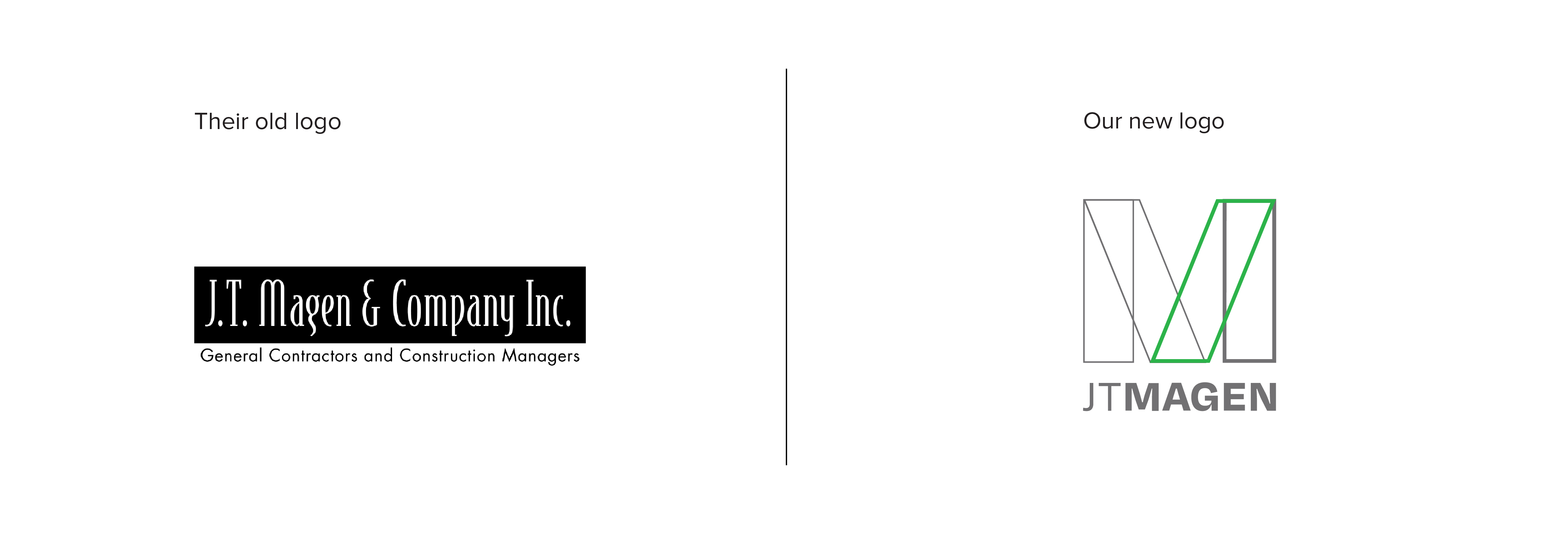
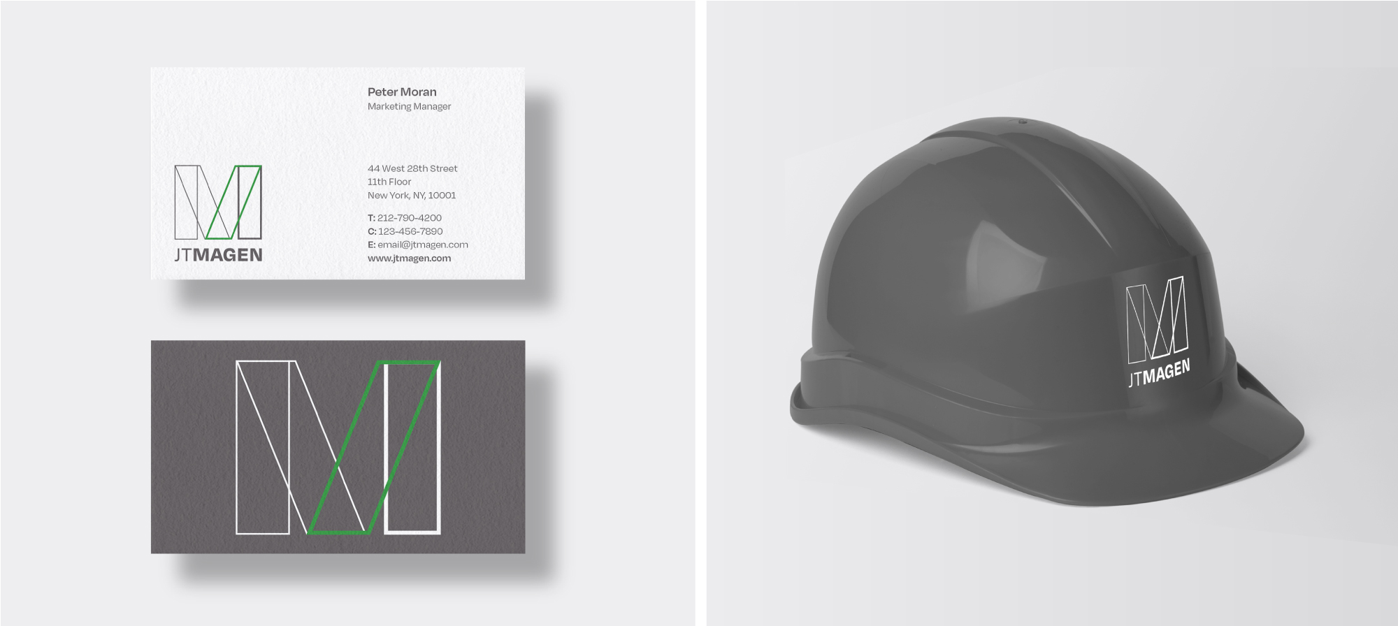
Odgis + Company rebranded J.T. Magen, a leading force in the construction industry, recognized among the top 50 U.S. general contractors. Collaborating closely with the J.T. Magen team, we redesigned their logo and wordmark and created logo animations that breathe life into the brand. From business cards to pitch decks, proposal templates, and the website, we meticulously designed all assets.
The logomark, based on the M form, is construction inspired and features a scaffold-like structure. Colored in aluminum tones, its solid and robust shape mirrors the strength of a building. Introducing a touch of green pays homage to the Irish roots of the founder, Maurice Regan, providing a distinctive visual element. The pitch deck and proposal templates adopt a crisp, minimal, and dynamic design, incorporating ample white space and tasteful use of the new color palette. Additionally, we developed a secondary logo system for JTM Construction Group Inc., an affiliated company.
The logomark, based on the M form, is construction inspired and features a scaffold-like structure. Colored in aluminum tones, its solid and robust shape mirrors the strength of a building. Introducing a touch of green pays homage to the Irish roots of the founder, Maurice Regan, providing a distinctive visual element. The pitch deck and proposal templates adopt a crisp, minimal, and dynamic design, incorporating ample white space and tasteful use of the new color palette. Additionally, we developed a secondary logo system for JTM Construction Group Inc., an affiliated company.
"Our new logo effectively incorporates the intricate and distinct craftsmanship J.T. Magen is known for into a sleek, innovative design, that both emulates who we are and how far we have come."
Robert Scheinman | Principal J.T. Magen
Case Study: Rebrand & Rename - Deriva Energy
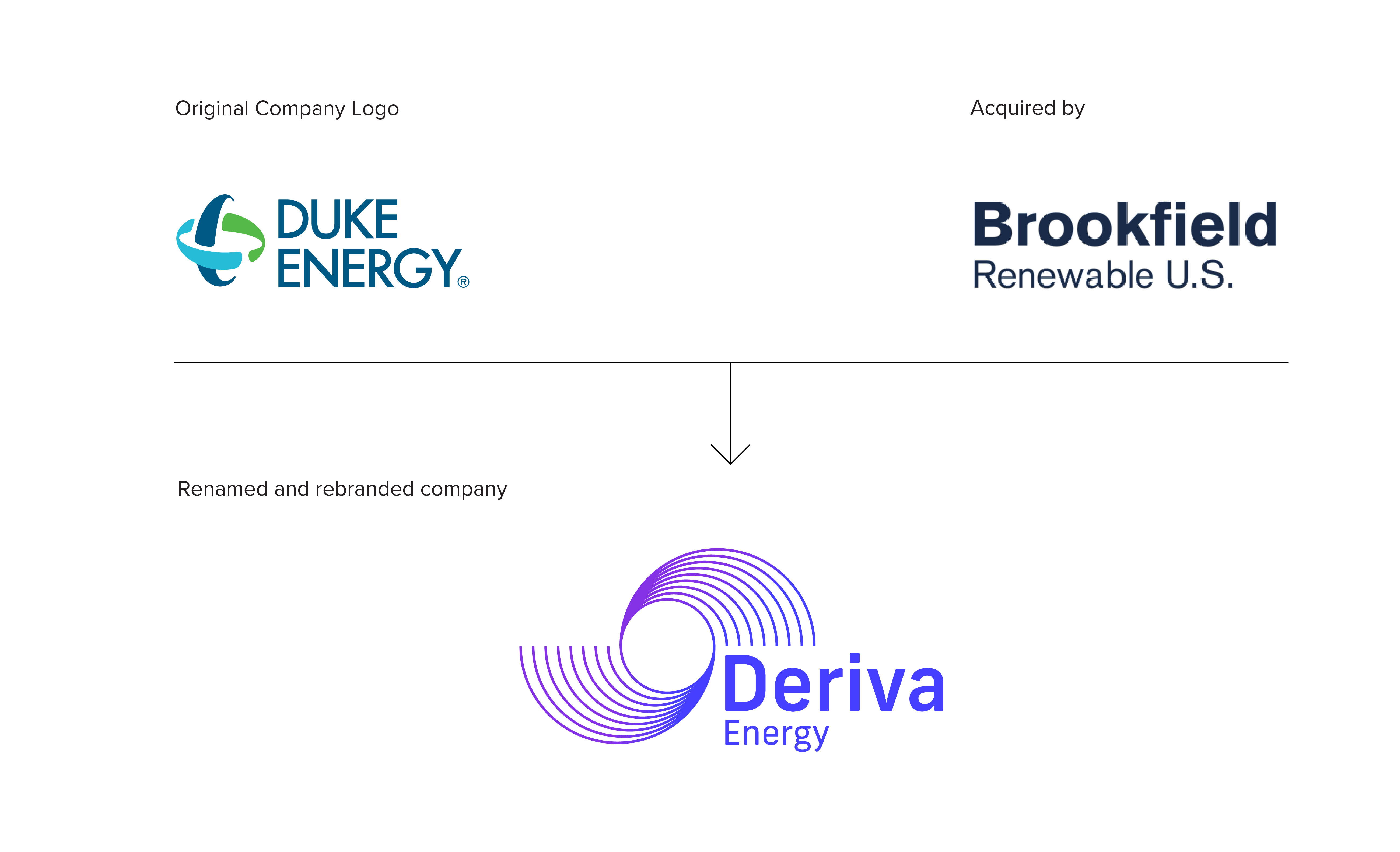
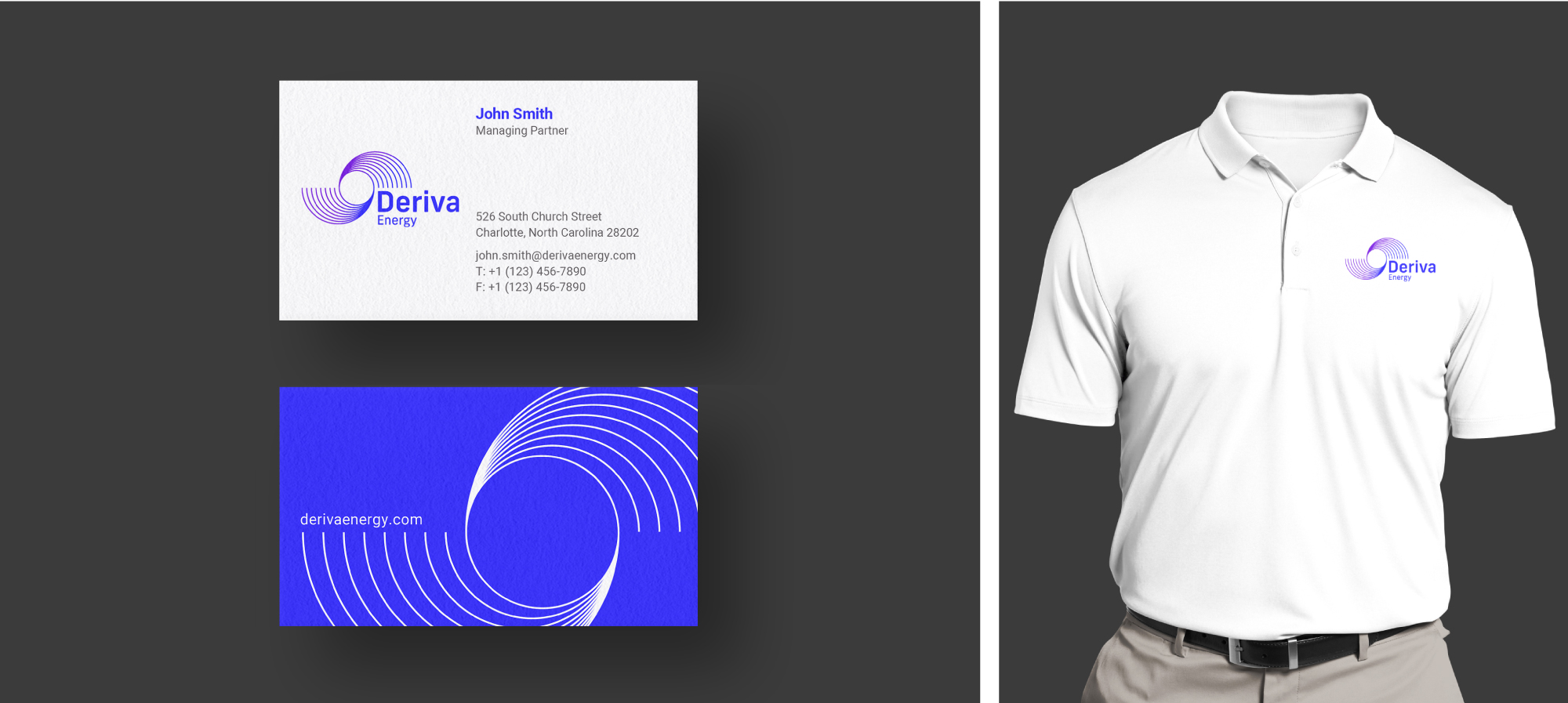
Odgis + Co has rebranded and renamed Deriva Energy, previously known as Duke Energy Renewables, following its recent acquisition by Brookfield Renewable. The choice of the name "Deriva" is rooted in the concept of derivation, signifying the obtainment or development of something from a source. This name reflects the company's focus on renewable power and its national reach.
The logo symbolizes both solar and wind energy. The circular flow of the lines in the design evoke the swirling blades of a wind turbine, while the negative space within the circle suggests the sun. The typographic form of the wordmark also conveys a sense of circular energy, radiating power.
The logo symbolizes both solar and wind energy. The circular flow of the lines in the design evoke the swirling blades of a wind turbine, while the negative space within the circle suggests the sun. The typographic form of the wordmark also conveys a sense of circular energy, radiating power.
"Thanks to everyone at Odgis + Co for the fine work! The brand and logo look amazing"
Richard A. Mahony, Corporate Communications | Brookfield Renewables

Case Study: Rebrand - Rubris
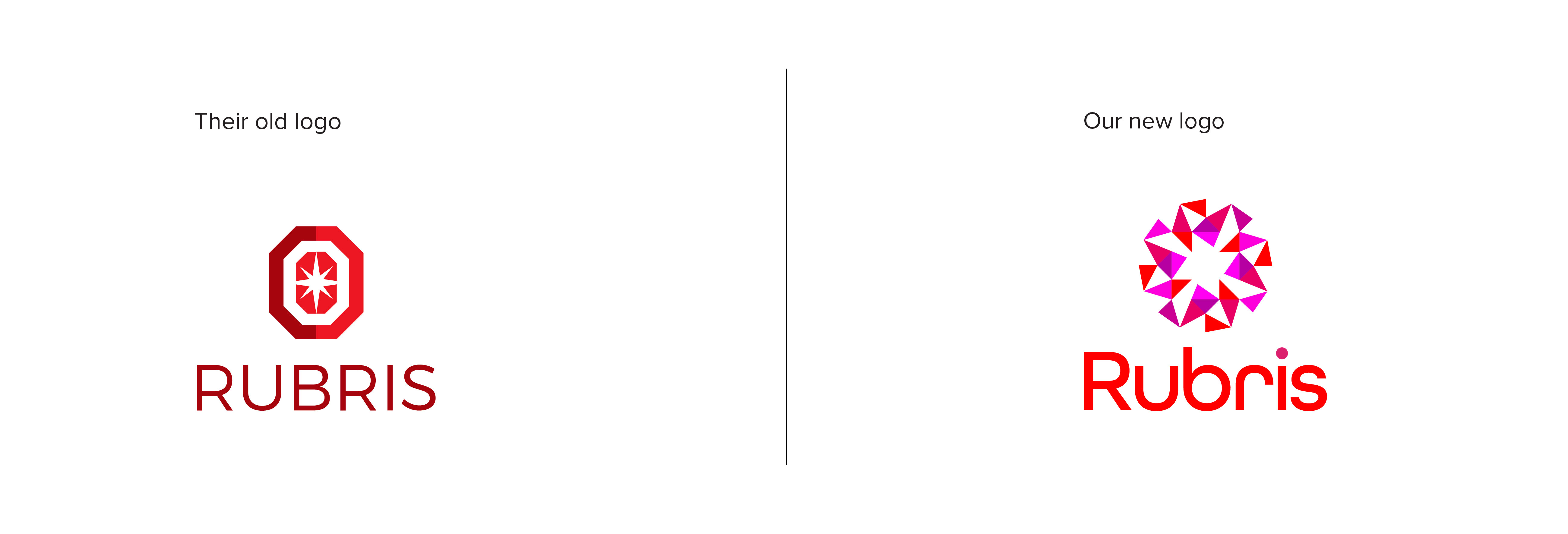
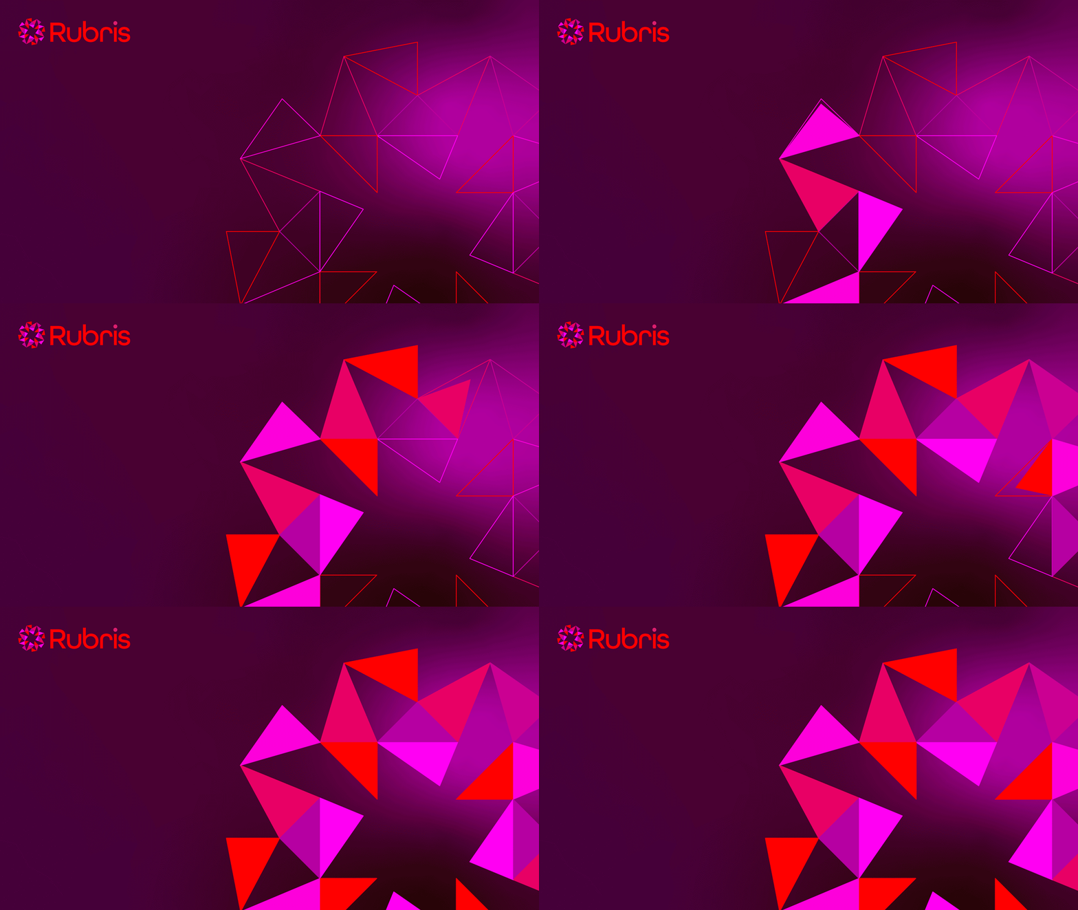
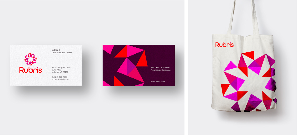
The Rubris brand design is inspired by its name: the way it sounds, the shape letterforms, the color palette and its semiotic reference to the multifaceted ruby. Our design is based on the concept of connection, with many elements housed in one gem. The wordmark is made of round letterforms that echo the sound of the word. Each of the assets we created, including the stationery system, marketing and proposal decks, and website, work together to support this identity as a differentiated mass tort platform. Odgis + Co designed the complete brand messaging platform.
"The quality of the designs and visual artifacts is the best I have ever had at my disposal. I strongly recommend Odgis + Co."
Nick D'Aquilla, Managing Director | Rubris
Case Study: Rebrand & Rename - Open to Debate
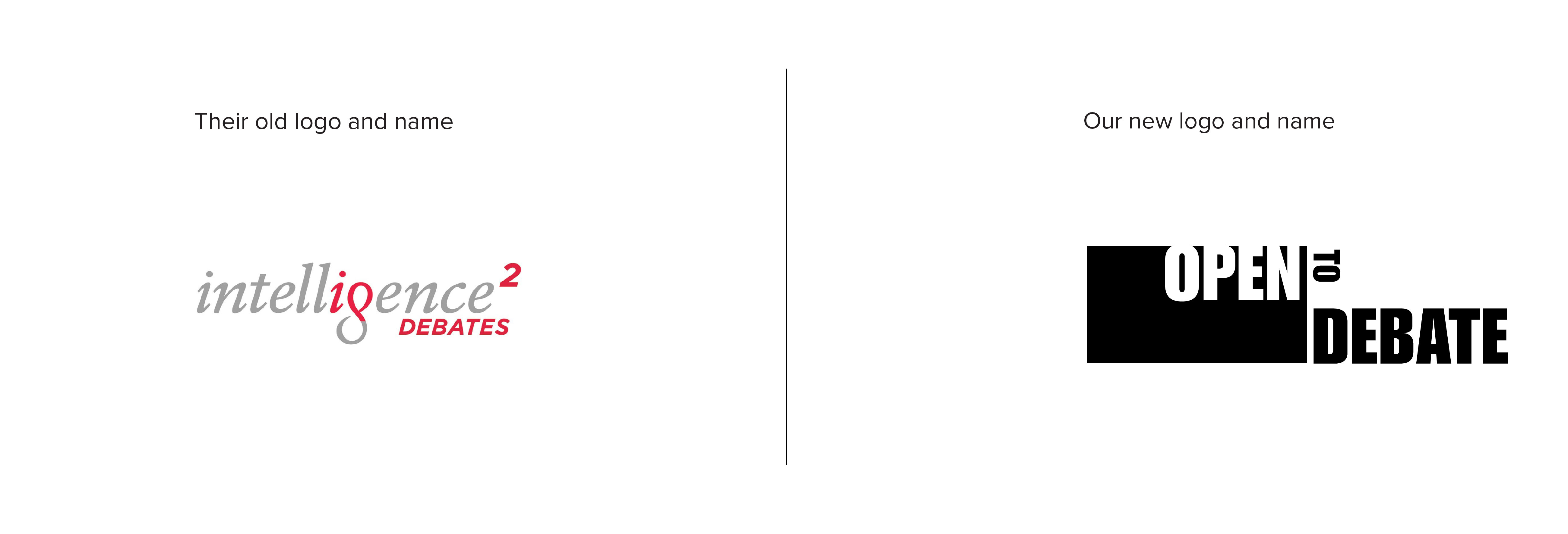
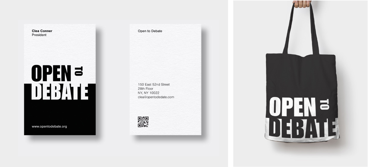
Odgis + Co had the opportunity to rename and rebrand Open to Debate, previously known as Intelligence Squared US. After interviews with key stakeholders and a team brand workshop, we created and trademarked their new name. Our scope included the creation of a full brand strategy platform and messaging. Our next step was to design the new logo, brand architecture, and color palette. Additionally, we integrated key assets into their new brand, including the look and feel of their website.
"Thank you to our creative partners at Odgis + Co for leading our naming strategy and logo design. Everyone loves the new name and logo!"
Clea Connor | Chief Executive Officer

About Odgis + Co
Our designs speak before you say a word. As a creative studio with an extensive list of industry awards and recognition, we take pride in our work. With Odgis + Co, you can leave in the past the frustration of inconsistent verbal and visual communication with your consumers.
Whether you represent a brand-new startup seeking to find its own unique voice or a well-established company adapting to ever-changing market trends, having a strong brand is of the essence. Ready to take a calculated risk and be on the frontlines of inevitable change? Contact Odgis + Co today and let’s talk about how we can improve your business’s face value.
Whether you represent a brand-new startup seeking to find its own unique voice or a well-established company adapting to ever-changing market trends, having a strong brand is of the essence. Ready to take a calculated risk and be on the frontlines of inevitable change? Contact Odgis + Co today and let’s talk about how we can improve your business’s face value.
