Digital Design
In the context of creative design, virtually everything that people view and interact with on-screen is, in fact, digital. Digital design is an umbrella of creative concepts that encompasses a variety of custom services we specialize in. As a branding agency, we approach creative strategy from various angles and help our clients determine which areas of their digital assets need a fresh touch. From front-end website development to advertising creatives, emails to pitch decks, illustrations to animations – if it’s not printed, it’s all digital.
“Design is the intermediary between information and understanding.”
Hans Hoffmann

WEB DESIGN
In today’s digital world, unrefined online presence is simply not enough. A new generation of tech-savvy consumers is seeking creative aesthetics, interactivity, and outstanding user experience. Your first-time website visitors will “judge the book by the cover”, so it’s crucial to discuss website branding. Does your current website coincide with your vision and mission? Does it accurately translate the nature and the voice of your brand? Who are your visitors and what are they looking for? Can they easily navigate to the information they need? And, most importantly, does it attract quality site visitors to your target audience? Your website is your ultimate virtual profile, and we can make it stand out from the competition.
PITCH DECK DESIGN
Making a great impression is half the success. Nowadays, it’s hard to surprise anyone with generic slides packed with text, sporadic bullet points, and callouts. To attract prospective clients, partners, and investors, businesses need to step up their game and move on from yesterday’s presentation platforms. When we design pitch decks, we make them pitch-perfect.
DIGITAL ADVERTISING DESIGN
Have you ever wondered what the secret is to successful digital marketing campaigns? We strongly believe in the visual impact. When the strategy seems impeccable but the creatives are not compelling enough, the click-through-rate leaves a lot to be desired. From dazzling social media ads to conspicuous display advertising, our graphics and animations immediately grab online users’ attention while communicating the essence of your brand.
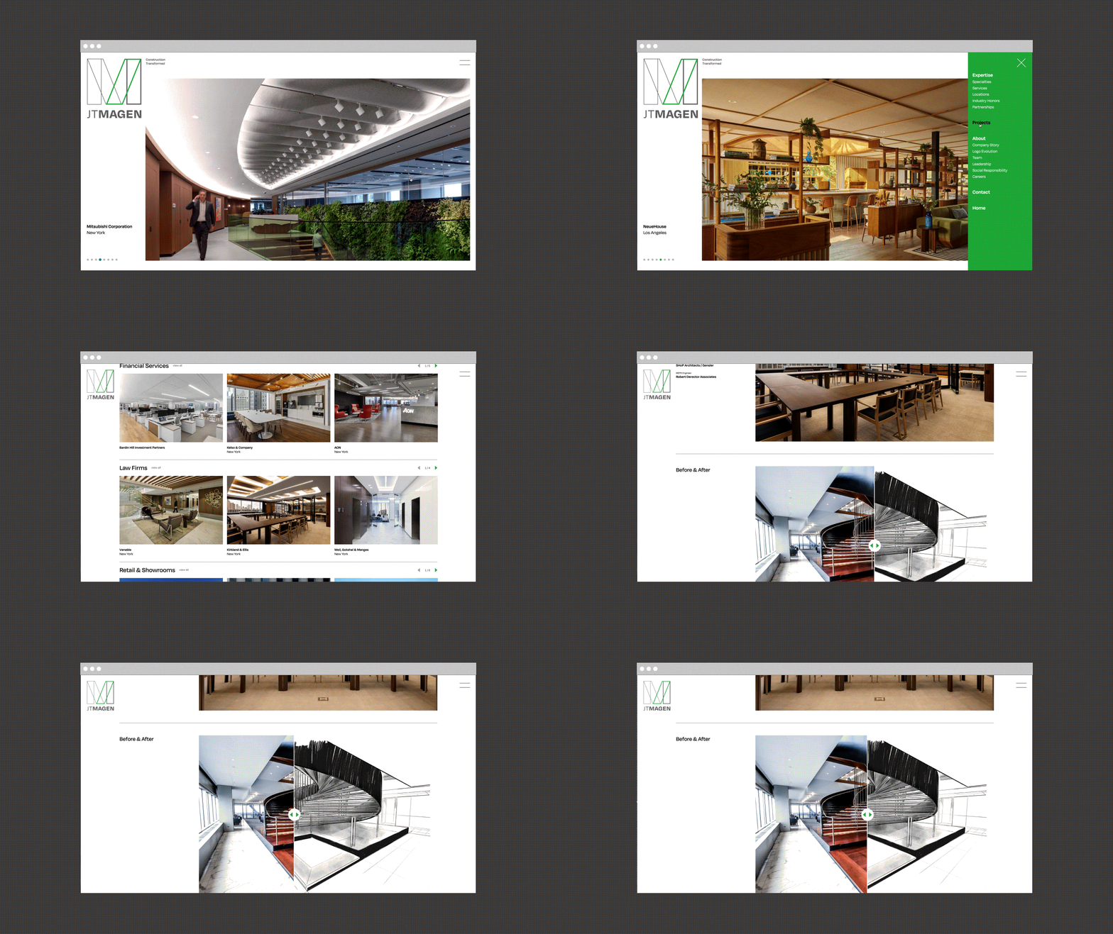
Case Study: J.T. Magen Website Redesign
Odgis + Company undertook the rebranding of J.T. Magen, a prominent construction industry leader, holding a position among the top 50 general contractors in the U.S.
Following the creation of J.T. Magen's new visual identity, we revamped the company's website, infusing it with an elegant, pristine, and sophisticated aesthetic that mirrors the excellence of the company's high-end projects.
Following the creation of J.T. Magen's new visual identity, we revamped the company's website, infusing it with an elegant, pristine, and sophisticated aesthetic that mirrors the excellence of the company's high-end projects.
Case Study: Rubris Website
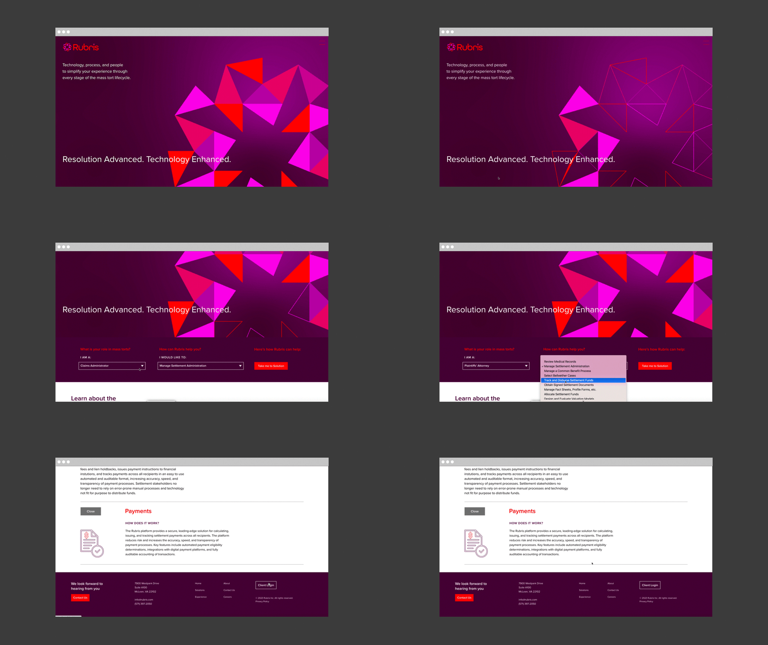
After designing the brand messaging platform and new visual identity for Rubris, we designed the company’s website. Using the logomark form, we created animations for each of the sections in the menu that explain this multifaceted company and what they do.

Case Study: Open to Debate Website
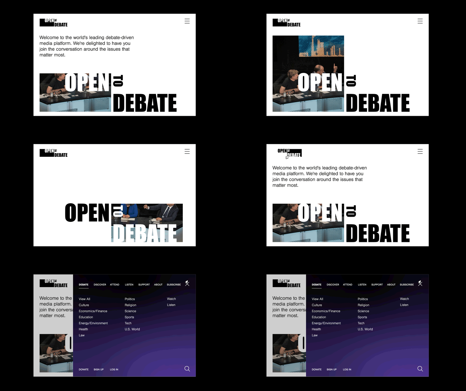
Open to Debate, previously known as Intelligence Squared US, is the original debate-driven media platform. An intellectually curious and open-minded audience can engage with people who hold opposing views on complex, nuanced issues. The animation reflects the spirit of a debate, swinging from one side to the other. At first the viewer sees only part of an image, and then the full image reveals itself before changing sides again. In our website prototype design we capture the spirit of the debate. The website is a rich library platform of videos, debates, and podcasts that are publicly available. It also hosts live debates and is interactive, allowing the viewers to vote before and after. A surprising number of people have changed their mind after hearing both sides of a debate.
Case Study: Wolf Popper Website Redesign
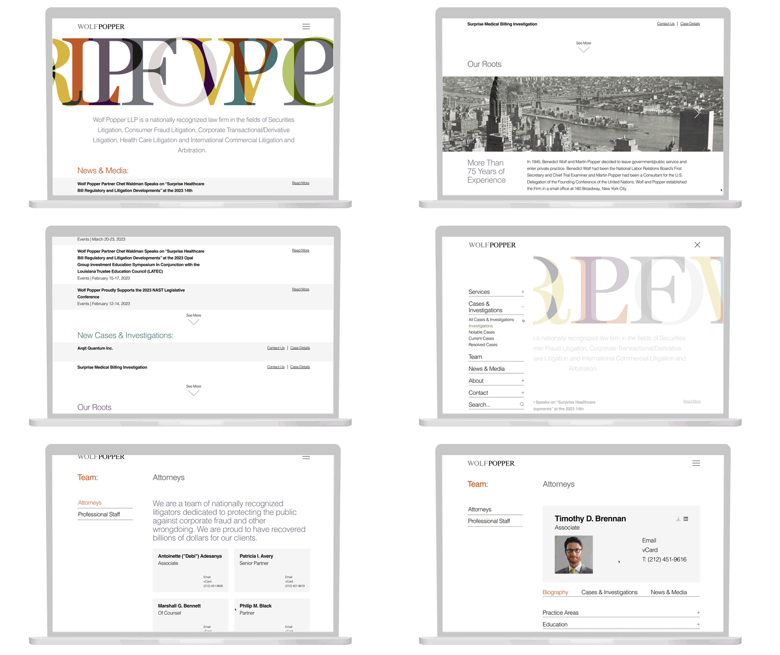
Wolf Popper, a 75-year-old nationally recognized law firm, came to Odgis + Co with a need for a reimagined website with a new look and a more intuitive navigation system.
We streamlined their website by eliminating stock photography and employing a typographic and minimalist approach, differentiating them from their competitors. For the website hero banner, we created an animation of translucent letterforms that form new colors as they overlap. The animation concept illustrates how they bring together ideas to create new perspectives. We used color judiciously throughout the site, giving bursts of color for a delightful surprise.
We streamlined their website by eliminating stock photography and employing a typographic and minimalist approach, differentiating them from their competitors. For the website hero banner, we created an animation of translucent letterforms that form new colors as they overlap. The animation concept illustrates how they bring together ideas to create new perspectives. We used color judiciously throughout the site, giving bursts of color for a delightful surprise.
About Odgis + Co
With over 35 years of experience, Odgis + Co has earned a reputation as one of New York City’s most distinguished creative agencies and brand consultancies. Our forward-thinking design has evolved with the dynamic market, keeping our clients at forefront of change. We deliver a user experience that is synergistic with clients’ goals and brand attributes.
