J.T. Magen Rebranding & Website
J.T. Magen
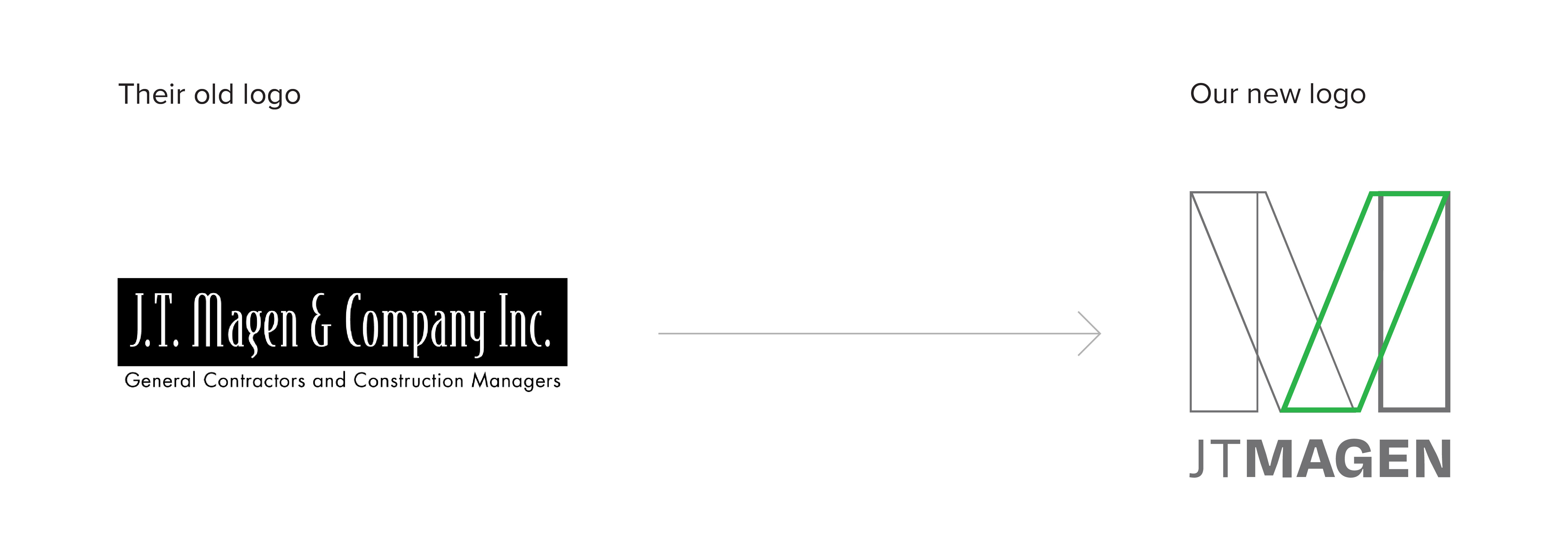
Odgis + Company rebranded J.T. Magen, a leader in the construction industry, which ranks in the top 50 U.S. general contractors, and in the top 20 companies for office construction and for telecommunications construction. Working with the J.T. Magen team, we redesigned their logo and wordmark. We designed logo animations to bring the logo to life, as well as all their assets, from the business card to their pitch deck, proposal template, and website.
The logomark, based on the M form, has a construction-inspired, scaffold-like form. The logo is the color of aluminum. Its shape, like a building, is solid and sturdy. To further differentiate the brand visually, we added a touch of green to represent the proud Irish beginnings of the founder, Maurice Regan. The pitch deck and proposal templates are crisp, minimal, and dynamic with lots of white space and discrete use of the new color palette. We designed a second logo system for JTM Construction Group Inc., an affiliate company.
In business since 1992, J.T. Magen has offices in New York, where it was ranked the No. 1 renovation contractor; Chicago where it was ranked the 13th largest general contractor; and Los Angeles, where affiliate JTM Construction Group Inc. has been working for companies like Microsoft, Latham & Watkins, and Equinox. They “Transform Construction.” They have built some of the most complex and challenging projects, including the fabrication of the first glass stairway in the Apple store, as well as the Nike store and Headquarters.
J.T. Magen is innovative, efficient, and detail-oriented. We found that we were highly compatible with their team and enjoyed the experience of working to bring this renewed brand to life.
See their new website here >
"Our new logo effectively incorporates the intricate and distinct craftsmanship J.T. Magen is known for into a sleek, innovative design, that both emulates who we are and how far we have come."
Robert Scheinman | Principal J.T. Magen


RELATED WORK

W. P. Carey
W. P. Carey Annual Reports

Rensselaer Polytechnic Institute
EMPAC Branding

